


SharePoint Mentor Curated Articles

Quick Links Web Part - Deep Dive Guide 2
Designing clear, useful, maintainable link experiences on modern SharePoint pages
- PURPOSE Explain what Quick Links is, how to configure it, when to use each layout, and how to apply governance and usability practices.
- AUDIENCE SharePoint site owners, page authors, intranet managers, support teams, and beginners.
- SCOPE Modern SharePoint pages in SharePoint Online. Interface labels may vary as Microsoft rolls out changes.
The Quick Links web part is a modern SharePoint page component used to pin links to a page so people can reach frequently used content quickly. Microsoft documents layouts including Compact, Filmstrip, Grid, Button, List, and Tiles, with layout-specific display options. Links can point to recent items, content from a site, OneDrive, uploaded content, or a URL. Quick Links can also use audience targeting to promote particular links to selected audiences.
CORE DESIGN PRINCIPLE Treat Quick Links as a curated launch pad, not as a dumping ground for every possible destination. Keep the collection purposeful, label destinations clearly, use consistent imagery, and review links throughout the site lifecycle.
What this guide covers

1. Quick Links fundamentals
1.1 What the web part does
Quick Links provides a visually structured collection of links on a modern SharePoint page. Microsoft describes it as a way to “pin” items to a page for easy access. It is especially useful when the page needs a deliberate set of destinations rather than a dynamic feed of content.
- Direct people to important pages, documents, libraries, lists, forms, tools, and external resources.
- Create task-oriented launch areas such as “Employee resources,” “Project tools,” or “Site owner actions.”
- Use icons, thumbnails, titles, and, in supported layouts, descriptions to improve recognition.
- Target individual links to defined audiences when a page serves multiple groups.
1.2 Where it fits in the modern page model
Microsoft describes web parts as the building blocks of modern SharePoint pages. Quick Links is one such component and is intended for modern pages. Page authors add it from the web part toolbox, configure its properties, then publish or republish the page.
1.3 When Quick Links is a good choice

2. Add and configure Quick Links
2.1 Add the web part
- Open the modern SharePoint page and select Edit.
- Open the Toolbox. Select See all web parts if needed.
- Select or drag Quick Links onto the page.
- Replace the default Quick Links title with a concise, meaningful heading when a heading helps page scanning.
- Choose a layout using the options available for the web part.
- Open Edit properties to configure additional settings offered by the selected layout.
- Add and refine links, then publish or republish the page.
MICROSOFT NOTE Some SharePoint functionality is introduced gradually. Your tenant may not yet show a feature, or the interface may look different from Microsoft documentation.
2.2 Add a link
Microsoft’s current guidance starts with + Add links. The destination picker can offer a recent file and content or imagery from locations such as a site, OneDrive, your computer, a URL, Microsoft stock images, and organization-approved images when configured.
- Select + Add links.
- Choose or provide the destination.
- Insert the selected page, document, image, or link.
- Review the item settings in the property pane and refine the title, image/thumbnail, description, or other available fields for the selected layout.
- Repeat only for links that serve the purpose of this link group.
- Publish and test the page as a typical visitor.
2.3 Edit and curate links
- Write link labels as destination or action names that make sense without explanation.
- Avoid several links with nearly identical titles unless the context makes the distinction obvious.
- Use descriptions only where they add decision-making value; do not repeat the title in sentence form.
- Use a predictable image or icon style. Mixed photographic thumbnails, logos, and unrelated icons can create visual noise.
- Remove obsolete shortcuts rather than allowing the web part to become an archive.
3. Layouts and selection strategy
Microsoft lists Compact, Filmstrip, Grid, Button, List, and Tiles layouts. Layouts expose different options. Microsoft specifically notes that Compact can show images, while List and Button can show descriptions. Compact is designed around 48 × 48 pixel icons; Filmstrip uses wider images in a 16:9 relationship.
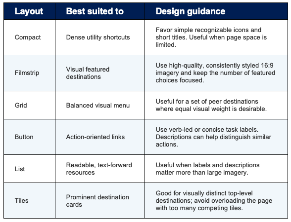
SELECTION RULE Choose the layout from the user’s decision task first. Pick Compact or List for scanning, Button for actions, and the more visual layouts when imagery genuinely helps users identify destinations. This is a design recommendation, not a Microsoft product requirement.
4. Audience targeting
4.1 Why use it
Microsoft supports audience targeting in Quick Links so specific links can be promoted to selected audiences. This can reduce irrelevant choices on shared landing pages and surface links that matter to particular groups.
4.2 Key behavior and boundary
- Supported audience choices are based on Microsoft Entra ID groups, including security groups and Microsoft 365 groups; Microsoft documentation also discusses dynamic-group support.
- Changes involving audience targeting need the page to be published or republished to take effect.
- Newly created or changed audience groups may take time before targeting is reflected.
- Audience targeting filters or prioritizes what people see. It is not a security control and does not replace permissions on the destination.
SECURITY RULE Never use audience targeting to protect confidential material. Secure the destination with appropriate SharePoint, Microsoft 365, or application permissions, then use targeting only to improve relevance.
5. Proper-use design and governance
5.1 Information architecture
- Group links by user intent: “Start a request,” “Find a policy,” “Team tools,” or “Training,” rather than by internal system ownership.
- Avoid duplicating the site’s primary navigation unless the duplication serves a deliberate landing-page purpose.
- Prefer stable destinations. If a document changes frequently, link to a stable page, library, folder, or governed document location when that better matches the user’s task.
- Decide whether the page owner or a named content owner is responsible for each link collection.
5.2 Naming and accessibility
- Use descriptive link text instead of vague labels such as “Click here.”
- Keep titles brief enough to scan but specific enough to predict the destination.
- Do not rely on the thumbnail alone to communicate meaning.
- Maintain sufficient visual consistency and test the page at narrow/mobile widths.
- Where a destination is external or has an unusual behavior, make that context clear in the label or surrounding page copy when helpful.
5.3 Permissions and destination quality
- Test destination access with representative users, not only site owners.
- Confirm that restricted documents, pages, lists, and apps enforce their own permissions.
- Check that external URLs are trusted, current, and appropriate for the intended audience.
- If the destination moves or is renamed, retest the Quick Link as part of the change.
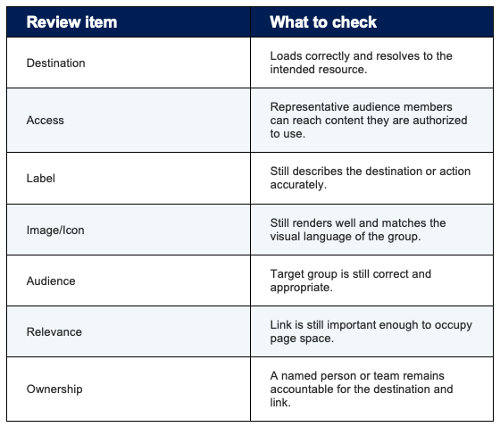
5.4 Lifecycle maintenance
6. Recommended patterns
Pattern A — Task launcher
Use a Button, Compact, or Grid presentation for the handful of high-frequency actions that users come to the page to perform. Label links with clear task language and keep lower-value reference links elsewhere.
Pattern B — Resource center
Use List when titles and short descriptions help users choose among related resources. Organize the surrounding page with headings so users understand the purpose of each group.
Pattern C — Visual landing page
Use Tiles, Grid, or Filmstrip for a small collection of prominent destinations supported by meaningful imagery. Keep image treatment consistent and avoid turning every minor shortcut into a visual card.
Pattern D — Shared page, role-aware shortcuts
Use audience targeting when one page serves multiple groups and some shortcuts are relevant only to particular audiences. Keep universal links untargeted, and secure destination content independently.
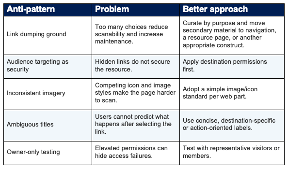
6.1 Anti-patterns to avoid
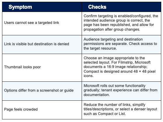
7. Troubleshooting
8. Quick Links implementation checklist
Plan
- Define the user task this Quick Links group should support.
- Identify a clear owner for the link set.
- Choose only destinations that earn prominent placement.
- Decide whether audience targeting is necessary.
Build
- Add Quick Links to the correct page section.
- Choose a layout that matches task density and visual importance.
- Create concise titles and optional descriptions.
- Apply consistent images/icons.
- Configure audiences only where they improve relevance.
Test
- Open every destination.
- Test with representative user permissions.
- Test targeted and untargeted experiences where applicable.
- Check desktop and narrow/mobile presentation.
- Verify titles, descriptions, imagery, and ordering.
Publish & maintain
- Publish or republish the page after changes.
- Include the web part in periodic content review.
- Remove obsolete links promptly.
- Revalidate destinations after restructures, migrations, or permission changes.
9. Microsoft references
This guide was grounded primarily in current Microsoft Support and Microsoft Learn documentation. Product UI and feature availability may change over time.
- Use the Quick Links web part
https://support.microsoft.com/en-us/sharepoint/sites-pages/use-the-quick-links-web-part - Using web parts on SharePoint pages
https://support.microsoft.com/en-us/sharepoint/web-parts-and-apps-in-sharepoint/using-web-parts-on-sharepoint-pages - Target content to a specific audience on a SharePoint site
https://support.microsoft.com/en-us/sharepoint/sites-pages/target-content-to-a-specific-audience-on-a-sharepoint-site - Target navigation, news, files, links, and web parts to specific audiences
https://support.microsoft.com/en-us/sharepoint/data-and-lists/target-navigation-news-files-links-and-web-parts-to-specific-audiences - Resources web part (for centrally managed-links comparison)
https://support.microsoft.com/en-us/sharepoint/sites-pages/resources-web-part