

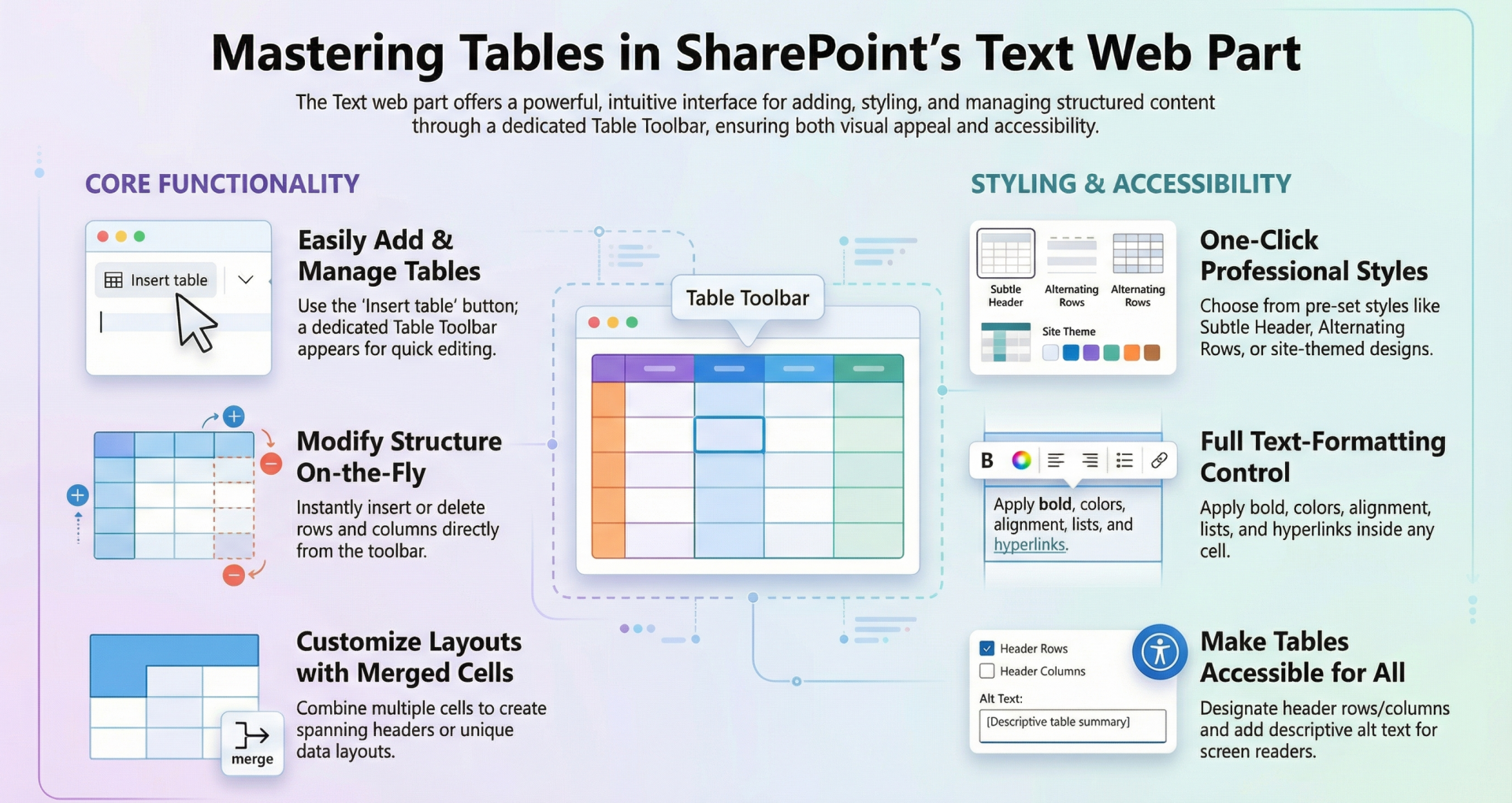
Tables in the Text Web Part for SharePoint Online
The Text web part in SharePoint Online is a versatile tool for adding and formatting text content on modern pages. It supports rich text editing, including the insertion of tables, which allow users to organize data in a structured format.
Tables can be styled, edited, and enhanced for accessibility, making them suitable for various use cases such as data presentation, comparisons, or simple layouts.
This article provides a comprehensive overview of all feature options for tables within the Text web part, based on the latest available functionalities as of January 2026. Key enhancements in recent years include improved accessibility (introduced around 2023-2025) and the dedicated Table Toolbar (rolled out in early 2025), which consolidates and expands table management tools. These features build on the core table capabilities, ensuring better usability, responsiveness, and inclusivity.
Adding Tables - To insert a table in the Text web part:
- Place your cursor where you want the table to appear.
- In the formatting toolbar, select the Insert table button. This may appear directly in the toolbar or under the More styles' menu, depending on your SharePoint version and screen size.
- A default 3x3 table grid is inserted. You can immediately start typing in cells or expand it as needed.
Once inserted, the Table Toolbar (introduced in 2025) appears, providing persistent access to table tools while you work on the table. This toolbar stays in focus, reducing the need to switch contexts, and adapts responsively—in narrower page sections, options move to an overflow (...) menu. Alternatively, right-click the table to access the Text and table formatting pane, which offers similar options but in a side panel.
Tables in the Text web part support a range of styling options to enhance visual appeal and readability. These are accessible via the Table Toolbar or the formatting pane.
Table Styles
- Plain: Basic grid with no additional formatting.
- Subtle Header: Header row with a bottom border for subtle emphasis.
- Header: Solid color header row with reversed font color (e.g., white text on a colored background).
- Alternating Rows: Header with solid color and reversed font, plus shaded alternating rows for better distinction.
- Column Header: Combines header styling with shaded first column and alternating rows.
- Themed Styles: A second row of style options that incorporate your site's theme colors for consistency with the overall site design.
- Expanded Styles (via Table Toolbar): Includes all the above plus additional formatting options for custom looks, such as varying border styles or color accents.
Text Formatting Within Cells
- Use the standard text toolbar or formatting pane to apply styles like bold, italic, underline, font color, highlight, alignment (left, center, right, justify), lists (bulleted/numbered), and hyperlinks.
- Font sizes and styles (e.g., headings) can be applied per cell or selection.
- Align the entire table within the web part. left, center, or right. This is useful for layout purposes on the page.
Spacing Options
- Add Space Before and After: Insert padding above or below the table to improve readability and separation from surrounding content. This is a new feature in the Table Toolbar.
Editing Rows, Columns, and Cells
Tables are highly editable, allowing dynamic adjustments.
Inserting and Deleting Rows/Columns
- Insert Row Above/Below: Add a new row directly above or below the selected row.
- Insert Column Left/Right: Add a new column to the left or right of the selected column.
- Delete Row/Column: Remove the selected row or column.
- Delete Table: Remove the entire table.
These options are available in the Table Toolbar or formatting pane.
Cell Operations
- Merge Cells: Combine multiple selected cells into one, ideal for creating headers spanning columns or custom layouts.
- Split Cells: Divide a merged cell back into individual cells.
- Resizing: Hover over column borders to drag and resize columns. Rows adjust automatically based on content.
Navigation and Editing
- Use the Tab key to move between cells and automatically add new rows when reaching the end.
- Click into any cell to edit text directly.
Accessibility Features
SharePoint emphasizes inclusivity, with table-specific tools in the Table Accessibility section of the property pane (accessible via the Table Toolbar or right-click).
- Mark First Row as Header: Boldens the first row and designates it as a header for screen readers (e.g., Narrator announces it as such).
- Mark First Column as Header: Boldens the first column and treats it as a header.
- Alternative Text: Set custom alt text for the entire table, providing a description for screen readers to improve navigation for visually impaired users.
Additionally, the SharePoint Accessibility Assistant (introduced in 2025) scans tables for issues like missing headers, alt text, or contrast problems, offering guided fixes during page editing.
Other Features and Integrations
- Inline Images and Content: Paste or insert images directly into table cells alongside text.
- Hyperlinks and Media: Add links, embeds, or other rich content within cells.
- Responsive Design: Tables adapt to different screen sizes and section layouts in the Text web part.
- Version Compatibility: Some features (e.g., themed styles, alignment) are exclusive to SharePoint Online and not available in SharePoint Server 2019.
Tips and Best Practices
- Performance: Keep tables concise to avoid page load issues; for complex data, consider the List web part instead.
- Accessibility Compliance: Always use headers and alt text for tables with data to meet WCAG standards.
- Customization Limits: Tables don't support advanced formulas or sorting like Excel; they're for static presentation.
- Troubleshooting: If styles or options are missing, check your site's theme settings or ensure the page is in edit mode.
- Updates: Features like the Table Toolbar enhance productivity—familiarize yourself with the overflow menu in compact views.