

Effectively Using Sections in SharePoint Online Pages for Content Organization
Sections in SharePoint Online are fundamental building blocks for structuring modern pages, allowing you to create visually appealing, organized layouts that enhance user experience. They enable the division of content into logical areas, supporting features like columns for side-by-side display, vertical placements for sidebars, flexible grids for creative designs, and collapsible options to manage lengthy content.
Effectively Using Sections in SharePoint Online Pages for Content Organization
By leveraging sections effectively, you can reduce clutter, improve navigation, and make information more accessible—whether for team sites, communication sites, or intranets.
Sections in SharePoint Online are fundamental building blocks for structuring modern pages, allowing you to create visually appealing, organized layouts that enhance user experience. They enable the division of content into logical areas, supporting features like columns for side-by-side display, vertical placements for sidebars, flexible grids for creative designs, and collapsible options to manage lengthy content.
By leveraging sections effectively, you can reduce clutter, improve navigation, and make information more accessible—whether for team sites, communication sites, or intranets.
Types of Sections in SharePoint Online
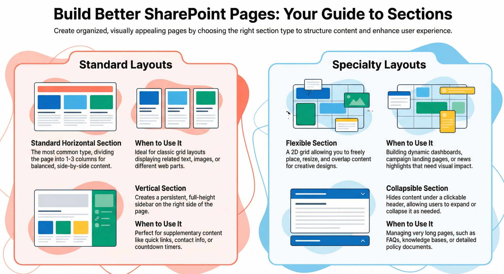
SharePoint Online offers several section types, each suited to different organizational needs. Understanding these helps in choosing the right one for your page layout.
- Standard Horizontal Sections with Columns
- These are the most common sections, allowing you to divide a page horizontally into up to three columns for side-by-side content display. They are ideal for balanced layouts where content needs to flow left to right.
- Key Features: Add 1-3 columns per section; stack multiple sections vertically; align content and add backgrounds for visual distinction.
- Use Cases: Displaying related items like text, images, or web parts in a grid-like structure.
2. Vertical Sections - Vertical sections appear on the right side of the page, spanning its full height. They act as a sidebar, perfect for supplementary content without disrupting the main flow.
- Key Features: Automatically adjusts length based on page content; moves to the top or bottom in narrow views (e.g., mobile); cannot coexist with full-width columns.
- Use Cases: Quick links, contacts, weather widgets, countdown timers, or metadata like related content. They provide prominence to actionable or personal items.
3. Flexible Sections - Introduced for more dynamic designs, flexible sections break free from rigid column structures, allowing web parts to be placed, resized, overlapped, and grouped on a 2D grid.
- Key Features: Drag-and-drop placement; grouping with Ctrl/Cmd + click; automatic mobile adaptation (reorganizes into a single column); supports overlays and custom backgrounds.
- Use Cases: Creative layouts like dashboards, news highlights, or campaign landing pages where elements need to overlap or be freely positioned for visual appeal.
4. Collapsible Sections - Any section (horizontal, vertical, or flexible) can be made collapsible, allowing users to expand or collapse content as needed. This is essentially a property toggle rather than a separate type.
- Key Features: Optional titles, divider lines, icon alignment (left/right), and default state (expanded/collapsed); headings can be customized by level.
- Use Cases: Managing long pages like FAQs, knowledge bases, or policy documents by turning them into a table-of-contents style interface.
Additional Layout Options
- Full-Width Columns: Available only on communication sites, these span the entire page width (no edges). Add them via a one-column section layout.
- Section Templates: Pre-designed layouts (e.g., with placeholders for images and text) available in the toolbox for quick starts. Select from the toolbox or "See all section templates."
- Tabs: While not a native section type, use the Tabs web part within sections to further organize content into switchable views, reducing overload on a single page.
Step-by-Step: Adding and Editing Sections - Adding a Standard Horizontal Section
- Navigate to the page and select Edit (top right) if not already in edit mode.
- Hover over the section border to reveal the + Section button (circled + with tooltip).
- Click + Section and choose the number of columns (1-3).
- Add web parts via the toolbox on the right.
Adding a Vertical Section
- Follow steps 1-2 above.
- Select Vertical section from the options.
- Edit properties to set narrow-view position (top or bottom).
Adding a Flexible Section
- Follow steps 1-2 for adding a section.
- Select Flexible from the toolbox.
- Add web parts, then drag, resize, or group them.
- Use the resize handle (bottom right) to adjust section size.
- Preview on desktop/mobile before publishing.
Making a Section Collapsible
- Edit the page and select the section.
- Click Edit properties (toolbar or right panel).
- Toggle Make this section collapsible ON.
- Customize title, divider, icon alignment, and default display (expanded/collapsed).
Editing Existing Sections
- Edit the page.
- Select the section and click Edit properties.
- Change column count, alignment, background (theme colors, gradients, or images), or other settings.
- Note: Reducing columns moves content leftward; some web parts may not show backgrounds.
Adding Content to Sections
- In edit mode, use the Toolbox to select or drag web parts (e.g., text, images, lists).
- Customize web parts as needed.
Best Practices for Organizing Content - To maximize sections' potential:
- Logical Grouping: Use sections to cluster related content—e.g., a full-width banner at the top, followed by two-column sections for main content, and a vertical section for navigation.
- Collapse for Lengthy Pages: Set sections to collapse by default; keep the top one expanded. Use descriptive titles and varied colors for visual cues.
- Mobile Responsiveness: Test layouts; flexible sections auto-adapt, but prioritize element order. Avoid full-width with vertical sections.
- Visual Hierarchy: Employ backgrounds and overlays for emphasis; use tabs within sections for sub-organization. Stick to a rhythm like one full-width, then balanced areas.
- Accessibility: Ensure text readability over backgrounds; use collapsible sections to reduce scrolling.
- Avoid Overload: Limit to 3-4 sections per page; use metadata in libraries for broader organization if needed.
Examples and Use Cases
- Intranet Home Page: Full-width hero section for announcements, two-column sections for news and events, vertical section for quick links.
- Knowledge Base: Collapsible sections for FAQs, each with a title like "Section 1: Getting Started."
- Dashboard: Flexible section with overlapped charts, images, and calls-to-action for interactive views.
- News Article: Tabs in a section to separate "Business," "Employee," and "Company" content.
- Policy Page: Collapsible sections for different regions (e.g., EMEA, North America) to target audiences.
Advanced Tips and Considerations
- Limitations: Vertical sections only on the right; no switching between flexible and other types; some features (e.g., templates, collapsibility) limited to Microsoft 365, not SharePoint Server.
- Integration: Combine with web parts like Call-to-Action or Anchor Links for better navigation.
- Monitoring: After publishing, track user interactions to refine layouts.
- Scalability: For large sites, consider metadata tagging in the Site Pages library to classify pages beyond sections.
By mastering sections, you transform SharePoint pages from static documents into dynamic, user-friendly experiences that boost productivity and engagement.