Description of the SharePoint "Mega Menu" Navigation Feature
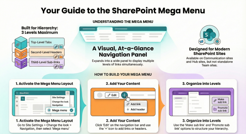
The SharePoint "Mega Menu" is a modern navigation layout available in SharePoint Online (part of Microsoft 365) designed to enhance user experience by displaying complex site navigation in a visually organized, at-a-glance format. Unlike traditional drop-down menus (such as the Cascading style), a Mega Menu expands into a wide panel that shows multiple levels of links simultaneously, making it easier for users to discover and access content without excessive clicking.
This feature is particularly useful for communication sites and hub sites, where it supports up to three levels of hierarchy: top-level tabs, second-level headers (displayed in bold for emphasis), and third-level sub-links. It promotes engagement by allowing site owners to showcase more content, such as grouped links by topic, region, or function, in a single view.
Key characteristics include:
- Availability: Exclusive to modern SharePoint experiences; not supported in on-premises versions or classic sites. It works on communication sites and hub sites (team sites can inherit it if associated with a hub). Mega Menus are optimized for horizontal navigation and appear as a slide-out pane in the SharePoint mobile app or on narrow screens.
- Hierarchy and Structure: Supports three levels maximum. Top-level items are clickable tabs. Second-level items can be headers (non-clickable labels for grouping) or links. Third-level items are indented sub-links under headers. If you only need two levels, the Cascading menu style is recommended instead.
- Audience Targeting: Links can be targeted to specific audiences (e.g., groups or users), so only relevant items appear for certain viewers. Non-targeted links are visible to all, even if the destination is inaccessible.
- Benefits: Improves discoverability for large intranets or sites with many linked pages/sites. It integrates with hub navigation, allowing consistent menus across associated sites. However, it's site-specific and requires at least three levels to fully leverage the panel layout.
- Limitations: Cannot be created on standalone team sites (use hubs for inheritance). No drag-and-drop for reordering (use promote/demote actions). Deleting a header removes its sub-items. It's not ideal for very simple menus.
Mega Menus were introduced in early 2019 and are now a standard feature for organizing modern intranets, especially in hub-associated sites.
How to Create a Mega Menu
Creating a Mega Menu requires site owner or administrator permissions. It involves enabling the layout in site settings and then building the hierarchy by adding and organizing links. Note that Mega Menus work best with horizontal navigation and at least three levels of content.
Prerequisites
- Ensure your site is a communication site or hub site (or associate a team site with a hub).
- Identify your navigation structure: Plan top-level tabs (e.g., "Home", "Departments"), second-level headers (e.g., "HR", "IT"), and third-level sub-links (e.g., specific pages or sites under each header).
- Mega Menus cannot be created on team sites directly; convert or associate if needed (Global/SharePoint Admins can convert sites to hubs via the SharePoint admin center).
Step-by-Step Guide to Create a Mega Menu
- Navigate to Your Site: Go to the SharePoint site where you want the Mega Menu (e.g., a communication or hub site).
- Access Site Settings: Click the Settings gear icon in the top-right corner.
- Change the Look: Select Change the look from the dropdown menu.
- Select Navigation: In the Change the look panel, click Navigation.
- Choose Mega Menu Layout: Under Navigation layout, select Mega menu (options include Horizontal, Vertical, Mega menu, or Cascading). Ensure the navigation is set to Horizontal for the panel to display properly.
- Save Changes: Click Save. The navigation bar will now use the Mega Menu style. If no links exist yet, it may look empty—proceed to add links (detailed below).
- Edit the Menu (Initial Setup): Hover over the navigation bar and click Edit (appears on the right side). This opens the editing panel where you can add your first items.
- Build the Hierarchy: Follow the "Adding Links" steps below to populate three levels. Once complete, click Save to apply.
- Test and Publish: View the site as a user (exit edit mode) to ensure the panel expands correctly on hover/click. On mobile, it appears in a hamburger menu as a side pane.
If your site is a hub, the Mega Menu will inherit to associated sites automatically. For PowerShell automation (advanced users), use PnP PowerShell cmdlets like Set-PnPNavigationNode to script the structure, but manual editing is recommended for beginners.
How to Add Links to the Mega Menu at Various Levels
Adding links involves editing the navigation menu and using actions like "Add link", "Add header", "Make sub link", and "Promote sub link" to build the hierarchy. Links can point to SharePoint pages, sites, external URLs, or even dynamic content. You can add them at the top level (main tabs), second level (headers or sub-items), or third level (nested sub-links). All users with edit permissions can do this, but changes are site-wide.
General Steps to Edit and Add Links
- Enter Edit Mode: On the site's navigation bar, click Edit (far-right of the horizontal menu).
- Add a New Item:
- Hover over an existing item (or the end of the menu) where you want to insert a new one—a + icon appears.
- Click the + to open the "Add a link" dialog.
- Enter the Link text (display name, e.g., "HR Policies").
- Enter the Web address or page (e.g., a SharePoint page URL like /SitePages/Policy.aspx, another site URL, or external link).
- Optionally, check Open in a new tab for external links.
- Click OK. The new item appears as a top-level link by default.
- Organize into Levels (Promote to Top Level or Add to Sub-Levels):
- Click the ellipses (...) next to any item for options.
- To Promote to Top Level: If an item is a sub-link, select Promote sub link. This moves it up one level (e.g., from third to second, or second to top). Repeat as needed.
- To Add to a Lower Sub-Level: Select Make sub link on an existing item to nest it under the parent (e.g., make a second-level item a third-level sub-link). Alternatively, drag (limited support) or use the + icon under a header.
- Add a Header (Non-Clickable Label for Grouping): In the + dialog, select Header instead of a link. Headers are bold second-level items for organizing sub-links (e.g., "Departments" as a header with "HR" and "IT" as sub-links). Ensure every header has at least one sub-link.
- Reorder Items: Use the ellipses to select Move up or Move down. For sub-levels, promote/demote as needed to adjust hierarchy.
- Target to Audiences (Optional): In the ellipses menu, select Audience to choose groups/users who see the link (requires Microsoft 365 group or security group setup).
- Remove Items: Select Remove from the ellipses. Note: Removing a header deletes all its sub-items.
- Save Changes: Click Save at the bottom of the edit panel. The Mega Menu updates immediately.
Examples of Adding Links at Different Levels
- Top Level (Promoted Main Tab): Add a new link (e.g., "Home") via +. It starts here. Promote any demoted items back to this level if needed.
- Second Level (Header or Sub-Link): Add a link under a top-level item (e.g., under "Departments", add "HR" as a header via + under the top tab). Make it bold by ensuring it's a second-level header. Promote a third-level item to here if reorganizing.
- Third Level (Lower Sub-Level): Add sub-links under a second-level header (e.g., under "HR", add "Policies" and "Benefits" via +). Use "Make sub link" on existing items to nest them. This creates the indented panel view in the Mega Menu.
Tips for Effective Management
- Best Practices: Use headers for logical grouping (e.g., by department) to avoid clutter. Limit to 3-5 top-level items for usability. Test on desktop/mobile.
- From Site Pages: To add a page directly, go to Site contents > Site Pages, select a page, and click Add to navigation.
- Inheritance in Hubs: Edits on a hub propagate to associated sites; edit at the hub level for consistency.
- Troubleshooting: If levels don't appear, ensure three levels are defined and the layout is set to Mega Menu. For more than three levels, consider custom SPFx extensions (advanced).