Flexible Sections mark a significant enhancement to page design capabilities. This feature allows content authors to create dynamic, visually appealing pages without the constraints of traditional rigid column structures.
Below is a comprehensive overview of Flexible Sections, their features, benefits, limitations, and best practices, based on the latest available information.
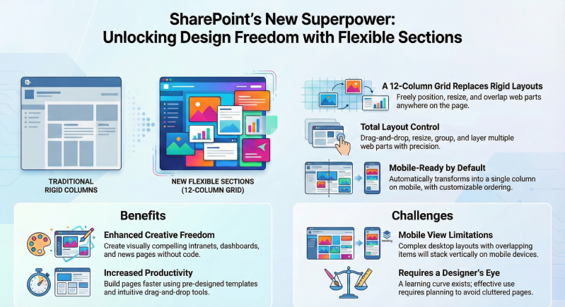
What Are Flexible Sections?
Flexible Sections are a new section type in SharePoint Online Pages and News, designed to provide greater creative control over page layouts. Unlike traditional sections (e.g., one-column, two-column, or three-column layouts), Flexible Sections use a 12-column grid system that allows authors to freely position, resize, overlap, and group web parts. This feature, also available in Viva Amplify, enables the creation of modern, dynamic, and engaging page designs, making SharePoint a more powerful content design platform.
Key Features of Flexible Sections
- Two-Dimensional Grid Layout:
- Flexible Sections replace the fixed column structure with a 12-column grid, allowing web parts to be placed anywhere within the section.
- Web parts snap to the nearest grid line when dragged, with alignment cues to assist precise placement, similar to design tools like Canva or PowerPoint.
- Drag-and-Drop Functionality:
- Web parts can be added to Flexible Sections via the Toolbox pane on the right side of the page canvas or by dragging them from other sections (e.g., column-based sections).
- Users can move web parts freely within the grid using a drag-and-drop interface, with drop hints to guide placement.
- Resizable Web Parts:
- Web parts can be resized using handles on their borders. The resizing options depend on the web part type:
- Non-Card-Based Web Parts (e.g., Text, Image, File, Media): Can be resized to most widths, constrained only by the grid or image aspect ratios.
- Card-Based Web Parts (e.g., Quick Links, People, Hero): Limited to four width options (full width, 1/3 canvas width, 1/2 canvas width, 2/3 canvas width), aligning with sizes in non-flexible sections.
- Resize hints appear to guide adjustments, ensuring alignment with the grid.
- Web parts can be resized using handles on their borders. The resizing options depend on the web part type:
- Overlapping Web Parts:
- Web parts can be overlapped within Flexible Sections, allowing creative layering (e.g., text over an image for banners). Users can adjust the z-order (bring to front/send to back) via the web part toolbar dropdown.
- Grouping and Multi-Selection:
- Multiple web parts can be selected (e.g., using CTRL+click) and grouped to move or arrange them together, enhancing design efficiency.
- Flexible Section Resizing:
- Sections can be resized manually using a resize handle at the bottom-right corner. The section height automatically expands if a web part is added at the bottom and requires more space.
- Mobile Responsiveness:
- Flexible Sections transform into a single-column layout on mobile devices to ensure readability.
- Authors can choose how web parts reorder on mobile: top-to-bottom (default) or left-to-right, configurable via the Section Properties pane. Note that overlapping web parts stack vertically on mobile, as overlaps are not supported.
- A Preview button allows authors to test how the section looks on different devices (e.g., desktop, tablet, mobile) or in email.
- Section Templates:
- New pre-designed Flexible Section Templates are available in the Toolbox pane, combining flexible and column-based layouts with example content. These templates provide a starting point for quick design while maintaining consistency.
- Templates can be customized after being added to the page.
- Support for Custom Web Parts:
- Flexible Sections support custom web parts built with the SharePoint Framework (SPFx), which can be resized to the four default width options. An upcoming SPFx v1.21 release (preview by end of February 2025) will add enhanced support for flexible layout configurations in the web part manifest.
- Background Settings:
- Flexible Sections support the same background settings (e.g., colors, images) as other section types, enhancing visual appeal. However, some web parts (e.g., Site Activity, Yammer, List Properties) do not currently allow the section background to show through, so avoid using background colors with these.
How to Use Flexible Sections
- Adding a Flexible Section:
- Navigate to a SharePoint page or news item and enter Edit mode (click Edit in the top-right corner).
- Click the + icon on the page canvas to add a new section.
- Select Flexible from the section toolbox. Note: Flexible Sections cannot be converted to other section types, and vice versa.
- Adding Web Parts:
- Use the Toolbox pane on the right to select or drag-and-drop web parts into the Flexible Section. Alternatively, drag web parts from other sections or duplicate existing ones.
- Web parts cannot be added directly via the usual “+” icon within the section.
- Customizing Layout:
- Move web parts by clicking the six-dot handle and dragging them to the desired grid position.
- Resize web parts using border handles and adjust overlap or grouping via the web part toolbar.
- Use the Section Properties pane (accessible by clicking the section and selecting settings) to configure mobile reordering (top-to-bottom or left-to-right).
- Previewing and Publishing:
- Use the Preview button to check responsiveness across devices or email.
- Save and publish the page once satisfied with the layout.
Benefits of Flexible Sections
- Enhanced Design Freedom: Authors can create dynamic, custom layouts without rigid column constraints, ideal for intranets, dashboards, or news pages.
- Improved User Experience: Visually appealing, well-organized pages enhance navigation and engagement.
- Time-Saving Templates: Pre-designed templates speed up page creation and ensure consistency.
- Mobile Optimization: Configurable reordering ensures accessibility on smaller screens.
- Productivity Boost: Faster content creation and updates due to intuitive drag-and-drop and resizing tools.
- Support for Creative Use Cases: Enables scenarios like employee onboarding portals, project dashboards, or visually engaging homepages with overlapped elements (e.g., text over images).
Limitations and Challenges
- Learning Curve:
- Users unfamiliar with graphic design principles may need training to use Flexible Sections effectively. Overcomplication can lead to cluttered or confusing designs.
- Mobile View Limitations:
- Overlapping web parts stack vertically on mobile, which may disrupt complex desktop layouts.
- Spacers are not supported in Flexible Sections, leading to potential “squished” content on mobile without strategic design.
- Web Part Placement Issues:
- Some users report difficulty placing web parts precisely, requiring multiple attempts. Once placed, repositioning can be tricky, and web parts may not stay in the intended location.
- Inconsistent Display:
- Published pages may display differently across users’ devices, even with identical settings, due to responsiveness or browser issues.
- Dynamic Resizing Bugs:
- Custom web parts that resize dynamically (e.g., expanding when a “more” button is clicked) may overflow the section container. Microsoft is addressing this, with fixes expected shortly after February 2025.
- Limited Web Part Support:
- Certain web parts (e.g., Site Activity, Yammer) do not support transparent backgrounds, limiting design options.
- No Direct Web Part Addition:
- Web parts must be added via the Toolbox or dragged from other sections, which can feel unintuitive.
Best Practices for Using Flexible Sections
- Plan Your Layout: Sketch the design beforehand to ensure a cohesive structure and avoid overcomplication.
- Use Alignment Cues: Leverage grid snap and alignment hints for precise web part placement.
- Group Related Content: Organize web parts logically (e.g., group news and links) to improve user experience.
- Test Responsiveness: Use the Preview button to test layouts on desktop, tablet, mobile, and email, adjusting mobile reordering as needed.
- Keep It Simple: Avoid overloading sections with too many web parts to maintain performance and clarity.
- Ensure Accessibility: Use SharePoint’s Accessibility Assistance to check for compliance, especially with overlapping elements.
- Use Templates: Start with Flexible Section Templates for consistency and efficiency.
- Monitor Performance: Test page load times, as complex layouts with many web parts may impact performance.
- Train Users: Provide guidance to content authors to prevent misuse and ensure effective designs.
- Combine with Standard Sections: Use Flexible Sections alongside column-based sections for balanced designs, especially for mobile optimization.
Use Cases for Flexible Sections
- Intranet Homepages: Create visually engaging landing pages with overlapping text, images, and Quick Links.
- Project Dashboards: Design dynamic dashboards with resizable charts, task lists, and document libraries.
- Employee Onboarding Portals: Build interactive portals with grouped training videos, HR policies, and contact information.
- News and Campaign Pages: Highlight announcements with layered text and media for impactful communication.
Availability and Rollout
- Timeline:
- Targeted Release: Began late January 2025, completing by mid-March 2025.
- General Availability (Production, GCC, GCC High, DoD): Mid-March to late April 2025.
- Preparation: No specific setup is required, but organizations should notify users, update training, and prepare help desks for the new feature.
Future Enhancements
- Microsoft plans to add more sizing options for all web parts and is exploring additional customization for mobile and email reflow.
- Integration with design tools like Figma may allow importing layouts directly into SharePoint in the future.
- SPFx v1.21 (preview by February 2025) will enhance support for custom web parts in Flexible Sections.
Conclusion
Flexible Sections in SharePoint Online revolutionize page design by offering a 12-column grid, drag-and-drop functionality, resizable and overlapping web parts, grouping, and mobile responsiveness.
While they provide significant creative freedom, challenges like placement issues, mobile limitations, and a learning curve require careful planning and governance.
By following best practices and leveraging templates, organizations can create dynamic, engaging pages for intranets, dashboards, and more. For further details, refer to Microsoft’s SharePoint Community Blog at
https://techcommunity.microsoft.com or Microsoft Support at https://support.microsoft.com.