SharePoint Online allows site owners and users with design permissions to customize the appearance of their sites through the "Change the look" feature.
This tool provides a user-friendly way to modify elements like themes, headers, navigation, and footers without requiring coding.
These customizations help align the site with organizational branding, improve usability, and enhance the overall user experience. The "Change the look" options are available in modern SharePoint sites (team sites and communication sites).
"Change the Look" Features and Settings in SharePoint Online
SharePoint Online allows site owners and users with design permissions to customize the appearance of their sites through the "Change the look" feature. This tool provides a user-friendly way to modify elements like themes, headers, navigation, and footers without requiring coding.
These customizations help align the site with organizational branding, improve usability, and enhance the overall user experience. The "Change the look" options are available in modern SharePoint sites (team sites and communication sites). Classic sites have limited or different options, and some features may not be available if classic publishing features are enabled. Permissions required typically include site owner or designer rights. If the option is not visible, check permissions or switch to the modern experience.
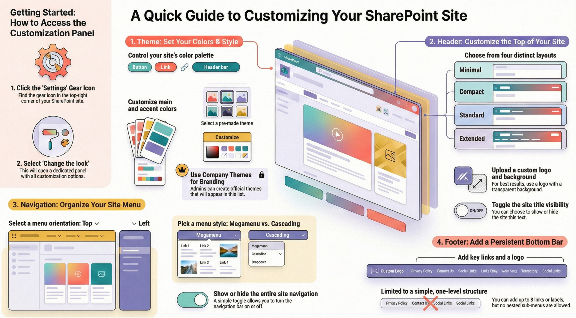
Access "Change the look" by selecting the Settings gear icon in the top-right corner of the site, then choosing Change the look. This opens a panel with sub-options: Theme, Header, Navigation, and Footer. Each section allows previews before applying changes. Note: Administrators can restrict certain customizations, such as limiting themes to company-approved ones. For advanced branding, tenant admins can use the SharePoint Brand Center to create and manage custom fonts and themes organization-wide.
Theme
The Theme section controls the color palette and overall visual style of the site, affecting elements like buttons, links, and accents.
How to Access and Use
- Go to Settings > Change the look > Theme.
- Browse available themes, which include previews showing how the site will appear.
- Select a theme: Choose from default SharePoint themes (e.g., Blue, Teal) or company-approved custom themes.
- To customize a default theme:
- Select the theme and click Customize.
- Choose a primary (main) color and up to six accent colors from a color picker or predefined options.
- Preview the changes, then select Save to apply or Cancel to revert.
- If company themes are available, they appear in the list for selection.
Sub-Options and Settings
- Primary and Accent Colors: Define the main site color and highlights (e.g., button backgrounds). Up to 16 color combinations can be set in custom themes via the Brand Center.
- Font Packages: While primarily under Navigation, theme selection can influence available fonts.
- Custom Themes: Tenant admins can create new themes in the Brand Center by selecting primary/secondary colors, adding custom colors, and saving them for site owners to use.
Notes and Limitations
- Background color cannot be changed directly here; it defaults to white or theme-based.
- Button colors are tied to accent colors and cannot be independently modified.
- Admins may hide default themes, showing only approved ones.
- For classic sites or subsites, use classic theming options (e.g., composed looks).
- Differences by Site Type: Team sites and communication sites both support this, but hub sites may inherit themes from the hub, limiting changes.
- Permissions: Site owner or designer required. For custom theme creation, Brand Manager role in the Brand Center.
Tip: Use the Microsoft Theme Generator tool for testing custom color schemes before applying via admin tools.
Header - The Header section customizes the top area of the site, including the logo, title, background image, and layout.
How to Access and Use
- Go to Settings > Change the look > Header.
- Choose a layout and customize elements.
- Preview changes, then save.
Sub-Options and Settings
- Layout Options:
- Compact (default for modern sites): Smaller header with logo and title side-by-side.
- Standard: Larger header with more space for background images.
- Minimal: Slim header with basic elements.
- Extended: Taller header for prominent branding (temporarily unavailable in some clouds like GCC, DoD).
- Site Logo:
- Upload a custom logo (JPG, PNG, SVG recommended; size: up to 2560x164 pixels for backgrounds).
- Change the thumbnail (square version for icons).
- Background Image:
- Upload an image to appear behind the header.
- Adjust focal point for cropping on different devices.
- Recommendations: High-resolution images (e.g., 1920x1080) with transparent backgrounds for overlays.
- Site Title and Description:
- Edit the title display (show/hide).
- Add or modify a short description below the title.
- Typography and Colors:
- Go to the Design Tab to select font packages for header text.
- Colors tie to the selected theme.
Notes and Limitations
- Logos should have transparent backgrounds for best results.
- Extended layout may not be available in all environments.
- Changes apply site-wide; no per-page headers.
- Differences by Site Type: Communication sites often use extended headers for visual impact, while team sites default to compact for functionality.
- Permissions: Site owner or designer.
- Tip: For optimal display, test on mobile devices as headers adapt responsively.
Navigation
The Navigation section adjusts the site's menu structure, orientation, and style for better accessibility.
How to Access and Use
- Go to Settings > Change the look > Navigation.
- Select orientation and style.
- Edit links separately via navigation editing tools.
- Save changes.
Sub-Options and Settings
- Orientation:
- Horizontal: Menu at the top (default for many sites).
- Vertical: Menu on the left side.
- Style (for Horizontal):
- Megamenu: Expands into a large panel with multi-level links (up to 3 levels; 3rd level shows as vertical list).
- Cascading: Dropdown menus for sub-items.
- Site Navigation Visibility: Toggle to show/hide the entire navigation bar.
- Typography:
- In the Design Tab, select from font packages to change navigation font styles.
- Editing Links:
- Add, remove, or reorder links (up to 3 levels in megamenu).
- Include labels, URLs, or internal pages.
Notes and Limitations
- Megamenu not supported if classic publishing features are enabled (deactivate via Site Features).
- Maximum 8 top-level links recommended for usability.
- Global navigation (app bar) can override site navigation if enabled tenant-wide.
- Differences by Site Type: Team sites may emphasize vertical navigation for document libraries; communication sites favor horizontal megamenus for content-heavy sites.
- Permissions: Site owner or designer.
Tip: For hub sites, navigation can be inherited or shared across associated sites.
Footer
The Footer section adds a bottom menu for additional links, often used for legal info or secondary navigation.
- How to Access and Use
- Go to Settings > Change the look > Footer (or edit directly if already added).
- Toggle footer visibility on/off.
- Select Edit to add content.
- Save changes.
Sub-Options and Settings
- Visibility: Turn the footer on or off.
- Links and Labels:
- Add up to 8 links or labels (one level deep; no sub-menus).
- Each item can be a URL, label (non-clickable), or internal link.
- Logo: Optionally add a small logo to the footer.
- Typography and Colors: Inherited from theme; customize fonts in Design Tab.
Notes and Limitations
- Footers are site-wide and cannot be page-specific.
- Limited to flat structure (no nesting).
- Differences by Site Type: More common in communication sites for branding; less used in team sites focused on collaboration.
- Permissions: Site owner or designer.
Tip: Use footers for accessibility links like privacy policies or contact info.
Advanced Customizations and Brand Center
For organization-wide branding:
- Brand Center: Accessible via SharePoint admin center (requires Global Admin or SharePoint Admin permissions). Create custom themes and fonts.
- Steps: Enable Brand Center, add custom fonts (upload TTF/OTF files), create themes with up to 16 color slots.
- Custom fonts require organization asset libraries in public CDNs for cross-geography support.
- Programmatic Options: Use PowerShell or Graph API for bulk changes (e.g., apply themes to multiple sites).
- Classic vs. Modern Differences: Classic sites use "Composed Looks" under Site Settings > Look and Feel, with master pages and CSS overrides. Modern sites prioritize declarative customizations for better performance.
Note: Always test changes in a non-production site to avoid disruptions.
Best Practices
- Align with organizational branding guidelines.
- Ensure accessibility (high contrast colors, readable fonts).
- Use previews extensively.
- For complex needs, consider SharePoint Framework extensions.